Cadillac Launching New Corporate Logo With Lyriq

There’s a new automotive trend afoot, one where industry giants alter their iconic corporate logos so they’ll play better in a digital environment. Shadows and color gradients designed to give an image depth don’t always pop on a cheap screen the way they might on the glossy piece of paper and have encouraged manufacturers to transmission to flat, monochromatic icons that look bad everywhere.
But consistency isn’t the only reason to change logos. It’s also an opportunity to signal to customers that you’re evolving as a brand, which is why so many companies have associated their new iconography with the pivot toward electric vehicles. General Motors, recently ditched the logo it’s been using (more or less) unchanged since 1964 for a Bizarro World alternative that swaps the color pallet and makes the letters lowercase. Now it’s modernizing the emblem to be used for Cadillac’s electrified products until they gradually supplant the entire lineup.
The resulting image is highly similar to what we’ve seen from BMW, Volkswagen, Nissan, and Kia — though the latter example is at least novel. Recipes traditionally involve stripping as much color as possible from the existing logo and then offering up a press release explaining how this symbol is an expression of the changing corporate ideologies as they make irrelevant proclamations about the need for a more just and sustainable future.
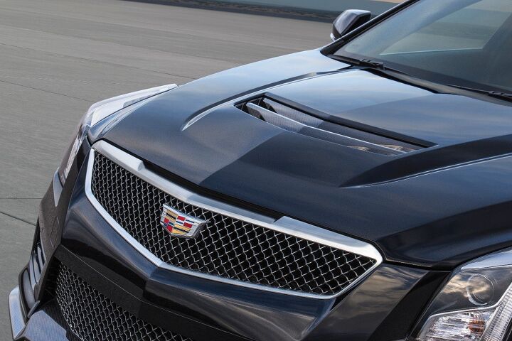
Sometimes there are even unique variants that denote when a car is utilizing an alternative-energy powertrain, such as the blue-ringed roundel BMW used on models like the i3. While this also applies to Cadillac — as the new emblem will be used exclusively on EVs — the monochrome logo will eventually replace the colorized shield the company has been using for over 100 years. However, it should be said that the wreath-and-crest design has gone through numerous incarnations within that timeframe and there was even a brief stint (1914) where Cadillac attempted to go without it.
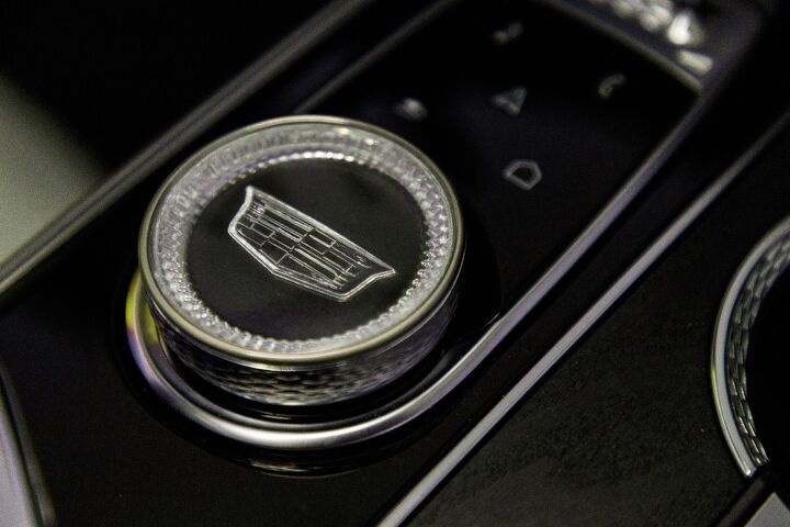
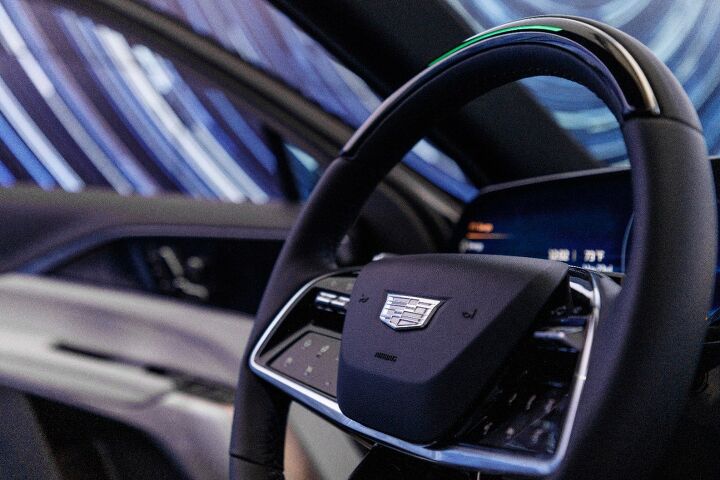
According to Fox News, the new icon is familiar in shape but ditches the wreath and simplifies the overall design by making everything black and white. Frankly, it doesn’t really work with a coat of arms that are supposed to be heavily reliant on color to convey what it is from a distance. We’re betting the new one looks like a gray blob once you’re standing a few steps back and we’ve got the upcoming Lyriq as evidence. GM has stated that the electric crossover will be the first Cadillac product to embrace the new crest and it’s all over the vehicle’s interior and exterior — often illuminated to add a sense of flare.
From Fox News:
A spokesman told Fox News Autos that the color version will continue on the legacy internal combustion engine models while the new one will roll out with the electric models that will be replacing them until it becomes an all-electric brand in 2030.
“The new crest along with our new tagline ‘Be Iconic’ represent Cadillac’s desire to champion each of us to dream big and become the most aspirational version of ourselves,” he said.
The outlet noted that a grayscale version of the emblem was available on gasoline models via the brand’s Onyx package and some dealers will also swap out a colorized version as an off-the-books option. But the official replacement is backlit and to be affixed exclusively to EVs. Having seen it on the Lyriq, the new shield doesn’t look half bad up close. Though it’s also a tad stodgy and serious, which is something most of these dumbed-down logos suffer from.
As there’s nothing in Cadillac’s upcoming lineup to pique my interest, it hardly matters what I think. However, you might find the Lyriq (due in 2022) right up your alley and believe the new crest to be an idyllic mate for the brand’s evolving image. Or you might think it’s an abomination. We’re interested in knowing either way and presumably so is General Motors.
[Images: General Motors]

Consumer advocate tracking industry trends and regulations. Before joining TTAC, Matt spent a decade working for marketing and research firms based in NYC. Clients included several of the world’s largest automakers, global tire brands, and aftermarket part suppliers. Dissatisfied, he pivoted to writing about cars. Since then, he has become an ardent supporter of the right-to-repair movement, been interviewed about the automotive sector by national broadcasts, participated in a few amateur rallying events, and driven more rental cars than anyone ever should. Handy with a wrench, Matt grew up surrounded by Detroit auto workers and learned to drive by twelve. A contrarian, Matt claims to prefer understeer and motorcycles.
More by Matt Posky
Latest Car Reviews
Read moreLatest Product Reviews
Read moreRecent Comments
- Lichtronamo Wouldn’t even look at a car w/out car play anymore.
- FreedMike Ah yes, my old car.(Sigh.)Not much I could add that Tim hasn't already, but I can wholeheartedly recommend it - it's a hoot to drive, and very easy to live with. I'll also be a contrarian and rep for the DSG. It's quicker than the manual, and far easier to work with in traffic. Tim doesn't mention this in the writeup, but DSG works better when you're shifting it manually, using the shifter paddles - you'll get probably 80-90% of the driver involvement you'd expect with a manual; in fact, I rarely let my old car shift for itself. I never regretted passing on a manual with this model. The only real sour notes I can mention here are a) you're restricted to the more expensive Autobahn package, which has a bunch of nice-to-have stuff, but hardly necessary (my car was the base S model, and it was comprehensively equipped), and b) it looks like VW is still fitting this car with the POS Hankooks my old car came with. The Hankooks were a model of consistency: consistently bad in the dry, bad in the rain, bad in the snow, and wore like crap (mine were done for at maybe 20,000 miles). If you want this car, spend the extra dough and get a set of Goodyear Eagle Sports (standard equipment on the GTI, by the way) - they are a major upgrade, and not unreasonably priced. Who knows? If VW is still making this when my lease is up in 2027, I wouldn't be opposed to taking another one of these home.
- ToolGuy™ New, no. Used, maybe? (Target $24K for a 2024MY)
- Zerofoo Less software, simpler designs, more robust materials = longer service life.The car with the smallest environmental footprint is the one that is never built.
- Zerofoo So long as automakers design in planned obsolescence, the answer is a resounding NO.Disposable garbage is always worse for the environment than quality products with a long service life.


Comments
Join the conversation
As a brand that has been around since 1902, Cadillac has always maintained a sense of timelessness and prestige. Need to check this https://www.aucklandconcretedriveways.co.nz/ and get more new ways for construction. This has led to the creation of numerous logos throughout the years. In order to appeal to an international audience, current CEO (and former Chrysler CEO) Michael Jackson has decided to create a new logo that can be used across all of Cadillac's brands. The new logo will take its inspiration from Lyriq, the small town in Texas where Cadillac was born more than 100 years ago.
Cadillac's new logo for the Lyriq is a bold move, reflecting their shift towards an electric future. It's fascinating to see how brands evolve with technology. For those looking to innovate their home exteriors, consider Edinburgh resin driveways. They offer both durability and aesthetic appeal and their expertise ensures a high-quality finish that complements any property. Thanks for sharing this exciting update!